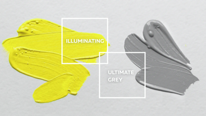
Professional home stager and real estate agent Kim Gaston gets candid about Pantone’s 2021 Colors of the Year, Illuminating and Ultimate Gray.
Each year, color matching company Pantone announces a color, or colors, that set the tone for current events, social happenings and design trends for the year ahead.
For 2021, Pantone chose the colors Illuminating, a shade of bright yellow, and Ultimate Gray, a shade of medium gray. The company describes this pairing as “a message of happiness supported by fortitude” and it says the combination represents hope in light of trying times.
The sentiment surely hits home for everyone in 2021. But for home décor? We consulted an expert for guidance on how to incorporate these two colors into homes this spring.

For 12 years, Kim Gaston has owned Front Porch Interiors, a home staging company in Colorado Springs, Colorado. Soon after starting her business, she earned her real estate license and became an agent with RE/MAX Advantage. The expertise combo equips her to help clients navigate every aspect of the home-selling process – and style their spaces to attract top dollar.
With an eye for design and a passion for helping others, Gaston gets candid about Pantone’s color choices.
Incorporating pops of yellow
As springtime rolls around, yellow becomes a popular accent color in the world of home décor.
According to Gaston, brighter colors – like yellow – are often utilized in muted shades for interior spaces.
“Illuminating is a clear color instead of a muted shade. Clear means that there’s not much gray in it,” Gaston says.
She expresses her hesitations about Illuminating, explaining that people are much more likely to opt for either softer or warmer shades of yellow inside their homes. Her best advice for those who do want to incorporate such a bright shade of yellow is what she calls the “60-30-10 rule.”
Gaston explains that, in a bedroom, 60% of the color scheme could be a neutral wall color and 30% could be a complementary color, like gray, in the bedding or a rug on the floor. The 10% remaining is a good place for brighter colors like yellows, through accent pillows, a throw blanket or yellow tulips in a vase on the nightstand.
“It’s an easy way to think about accent colors when you’re staging or selling a home,” she says. “You don’t want to overwhelm potential buyers with 60% [Illuminating] in a room.”
For a shade as bright as Illuminating, Gaston says she would opt against the shade altogether and instead pick one that mimics nature.
“Think about the yellows found in nature, in flowers like yellow tulips or forsythias. There are ways of using yellow, like a decorative bowl of lemons, that offer a more natural pop of color,” she says.
Alternatively, a “mid-century modern” aesthetic is a design trend that’s found renewed popularity the past few years. The style favors jewel tones, as well as a mustard color – a darker and warmer shade with a vintage feel – which has become a popular way to include yellow inside the home year-round.
Ultimately, one should decorate their living space in a way they love, whether that includes bright colors or neutrals. But Gaston is particularly focused on how colors used in staging can affect a home’s popularity while it’s on the market.
“I’m always considering how photography is going to look online and I try to keep the eye going around the room in a photo,” Gaston says. “It’s all about keeping the buyer engaged in the photos and driving the desire to customize the home themselves.”
Choosing the right gray
A more modern choice, gray has become a staple color in interior design. According to Gaston, gray can be a great neutral color for places like walls without being just another beige.
However, all grays are not created equal. Ultimate Gray by Pantone is an industrial shade with cooler notes. But when it comes to larger spaces like walls, grays in warmer shades are usually favorited over their cooler counterparts.
“[Oftentimes people go for grays that] have a warmer yellow or orange undertone to them so they don’t feel so cool and sterile. Especially in real estate, you really want the home to be warm and welcoming – and grays can be hard to pull off. If they have too much of a blue or green undertone, you might want to stay away from them,” Gaston says.
At the moment, home sellers and owners alike are veering toward warmer grays, she reports. Gaston describes fluctuating consumer preferences as a pendulum that is constantly swinging.
“The pendulum has moved back into the warmer, earthier tones, so right now we’re seeing a lot of ‘greiges’ – that’s gray with a warm beige undertone to it,” she says.
If Ultimate Gray is too cool of a shade for you, Gaston suggests Agreeable Gray or Amazing Gray, both by Sherwin Williams. Their yellow and orange undertones can create a calm, more inviting atmosphere – especially in the eyes of interested buyers when your home is for sale.


